How to Survive Google’s Mobilegeddon
If your website design is not optimized to be viewed on a mobile phone, it should be. A comScore report says smartphones and tablets combined now account for 60% of all online traffic. And now, Google’s found a way to reinforce the message that mobile-friendly matters.
This past February, Google released a statement warning business owners of an impending change that would forever alter the game of mobile SEO – a new page-ranking algorithm that actually penalizes non mobile-friendly websites. It has since been nicknamed “mobilegeddon,” referring to how “apocalyptic” this change is for millions of websites. So what does this mean for your credit union?
To put it simply, Google intends on rewarding websites with mobile-friendly designs by providing positive search engine rankings. It also means that websites who already have high search engine rankings could lose their position, and ultimately thousands of site visits per day, if they’re not optimized for mobile devices. But how do you know whether or not your website is “mobile friendly?”
Conveniently enough, there’s a Mobile-Friendly Test tool to test the mobile readiness of your website. According to a report conducted by BBC, sections of several large name websites have failed this test including Wikipedia, the European Union and BBC itself – meaning your credit union is not immune.
Here are a few things you need to focus on in order to pass Google’s test:
Text and Font Legibility
This may seem obvious but it’s crucial to ensuring your website’s mobile functionality. If your text is too small to read from a mobile device, your audience will find themselves straining to get through a single sentence. Equally important is your font type. Forcing your audience to decipher intricate, scripted fonts negatively impacts the mobile experience and may potentially lead consumers to visit your competitor’s page instead.
Size and Proximity of Tap Targets
Tap targets refer to any buttons, links, or form fields that appear on your pages on mobile devices. Having tap targets that are too small or set too closely together makes it difficult for users to accurately tap on a touchscreen device. Haven’t you ever pressed the wrong button or link on a website from your mobile device because the tap targets were far too small for your fingers? It’s frustrating for mobile users and also results in a lower mobile-friendly score through Google’s test.
Viewport Configuration
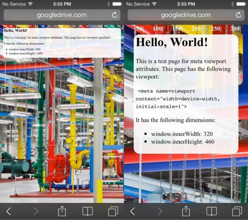
A viewport simply defines how large a webpage should be displayed on a mobile device. If you do not specify a viewport for your website, this means your pages will not be able to adapt to different devices, including smart phones and tablets. Instead, mobile devices will display pages at a standard desktop width scaled to fit the screen, forcing users to zoom in on the text and uncomfortably navigate through the webpage. See example below:
(Source: Google Developers) Left: A webpage without a specified viewport. Right: A page with a viewport customized to the device’s width.
Size Content to Viewport
Sizing your content to fit a specified viewport simply means ensuring your audience does not need to zoom out or scroll horizontally across the screen in order to see the entire webpage.
For more information on how to ensure your credit union’s website is mobile ready, visit Google Developer’s recommendations page at: https://developers.google.com/speed/docs/insights/rules
