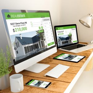
How Your Home Development’s Website Can Sell Homes
8 Things to Consider When Creating Your Community’s Website
Like most daily routines or big life decisions, the Internet has drastically changed our processes, and the home buying process is no different. Potential or active home buyers aren’t driving around with a Realtor® and touring from house to house anymore—they’re going straight to the Internet for their all their questions.
And where do they get their answers? From your home development’s website. Buyers want to know precisely what the home looks like and exactly what it includes before they step foot inside, and your website should answer that.
“The big issue is content,” says Julio Aceituno, associate interactive creative director at evok advertising. “It’s all about showing the community and selling the home and the lifestyle.”
As a homebuilder, your ultimate goal is to convert visitors into active buyers and get your homes sold, but your website needs to answer a lot of questions in order to do that. Here are eight things to consider when creating your community’s website that will answer any and all buyers’ questions.
Pictures and Then More Pictures
Whether it’s posting an item on eBay, driving more bookings on Airbnb or selling a home, photos are your biggest selling driver. It’s what draws the buyer in, stirs interest and keeps them on your website.
To that point, a photo gallery is a necessity, and you can’t skimp out on them. Even though you might be tempted to use your new iPhone X or hire your friend who took one photography class in college, seek out a professional whose niche is taking home development photos. A professional photographer knows what buyers want to see and can deliver that in high-quality photos.
Video Tours
When you build out your home development website, you can choose to let your photos stand alone or you can combine them with video tours to give users a true sense of the house or neighborhood.
There a variety of ways to go about creating a video, including walk-through videos, drone videos or a 3D interactive tour where the user chooses where they want to go inside the house. The type of video you choose depends on the type of house you’re trying to sell. For example, if you’re selling a three-story house with a large backyard, a 3D interactive tour coupled with a drone video might make the most sense for your community’s site.
Price and Quick Info
Before website visitors can become potential buyers, they need to know if the house is in their ballpark range and meets their needs. What is the house’s starting price? How many bedrooms does it have? How many square foot does it have?
These are buyers’ first questions, and they shouldn’t be buried within the page. Rather, they should be placed at the top of the page. Here’s some quick info that should be answered right away:
- What’s the starting price?
- What’s the square footage?
- How many bedrooms does it have?
- How many bathrooms does it have?
- How many floors is it?
Depending on the type of community the house is in, you can also answer questions about the backyard, front yard or garage.
Description
While the photo gallery is one of your biggest selling drivers, the descriptions of your floor plans and models get down to the details. And just like a professional photographer should take your photos, a professional copywriter should write your descriptions. Make sure these questions are answered for the potential buyer:
- What’s the surrounding community like?
- What does it feel like when you step inside the house?
- What design elements did the architecture integrate into the house?
- Does the house have any unique features?
Location
Location is a big selling point, and buyers need to know exactly where the house or neighborhood is located and what’s around the area without leaving your community’s website.
Integrate a map on your website and pin nearby schools, doctors, grocery stores or restaurants. Take it a step further and allow users to type in their address to see how far it is from their current location.
Amenities
Amenities can either be shown through images or words. You can list out the amenities included or you can post photos. Just make sure it’s broken down into categories so it’s easy for the buyer to digest in the information:
- Interior
- Exterior
- Kitchen
- Bathroom
- Other
Floor Plans
The floor plan gives prospective buyers a clear overview of the house. The photos and videos show the inside of the house, but the floor plan shows how it’s arranged. It’s a good idea to give users the option to download the floor plan or even integrate an interactive floor plan that allows them to start planning where to place the coffee table in the living room or the bed in the master suite.
CTAs and Contact Forms
A call to action (CTA) should be prominently placed on every page. Your potential buyers shouldn’t have to click to go back a page or even go to the home page to make an appointment or call your office. When they’re ready to take the next steps, the CTA should be handy.
On top of that, you can place a contact form or a request more information form at the footer of your page. “A person gets to the footer because that usually means they’re engaged with the content,” says Julio. And if they’re engaged with the content, they’re more likely to fill out a longer form.
Are you looking to build out a website to convert visitors to active buyers? Consider partnering with an advertising agency who can help you showcase your homes’ offerings and turn some houses in homes.